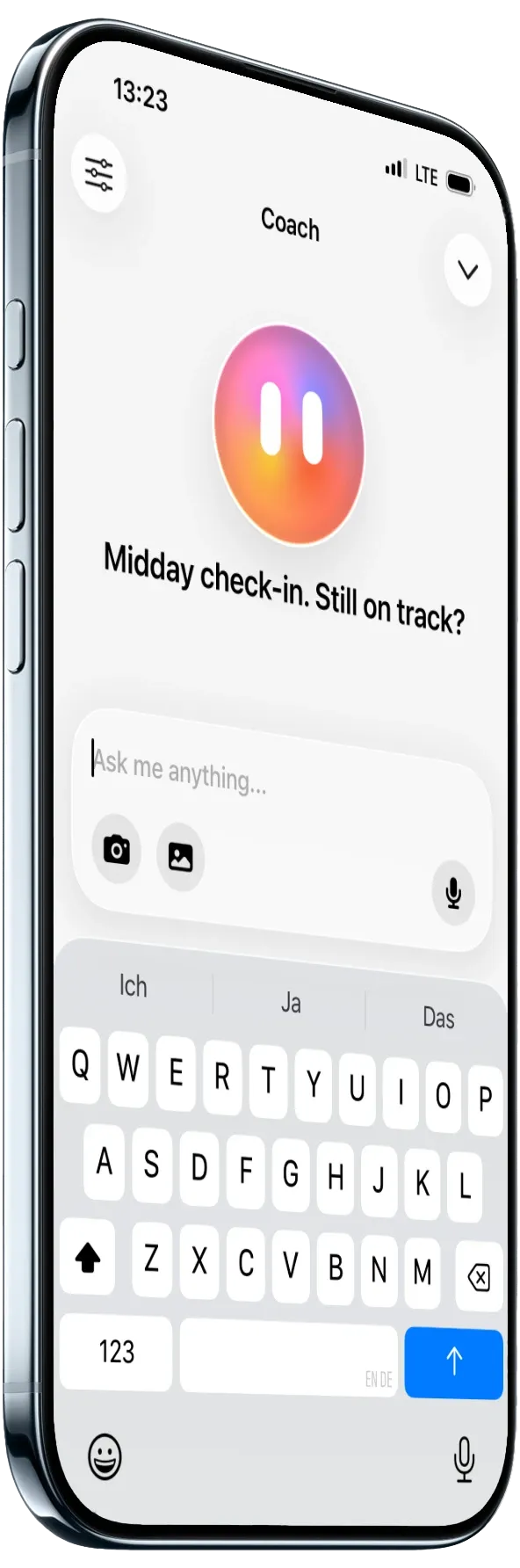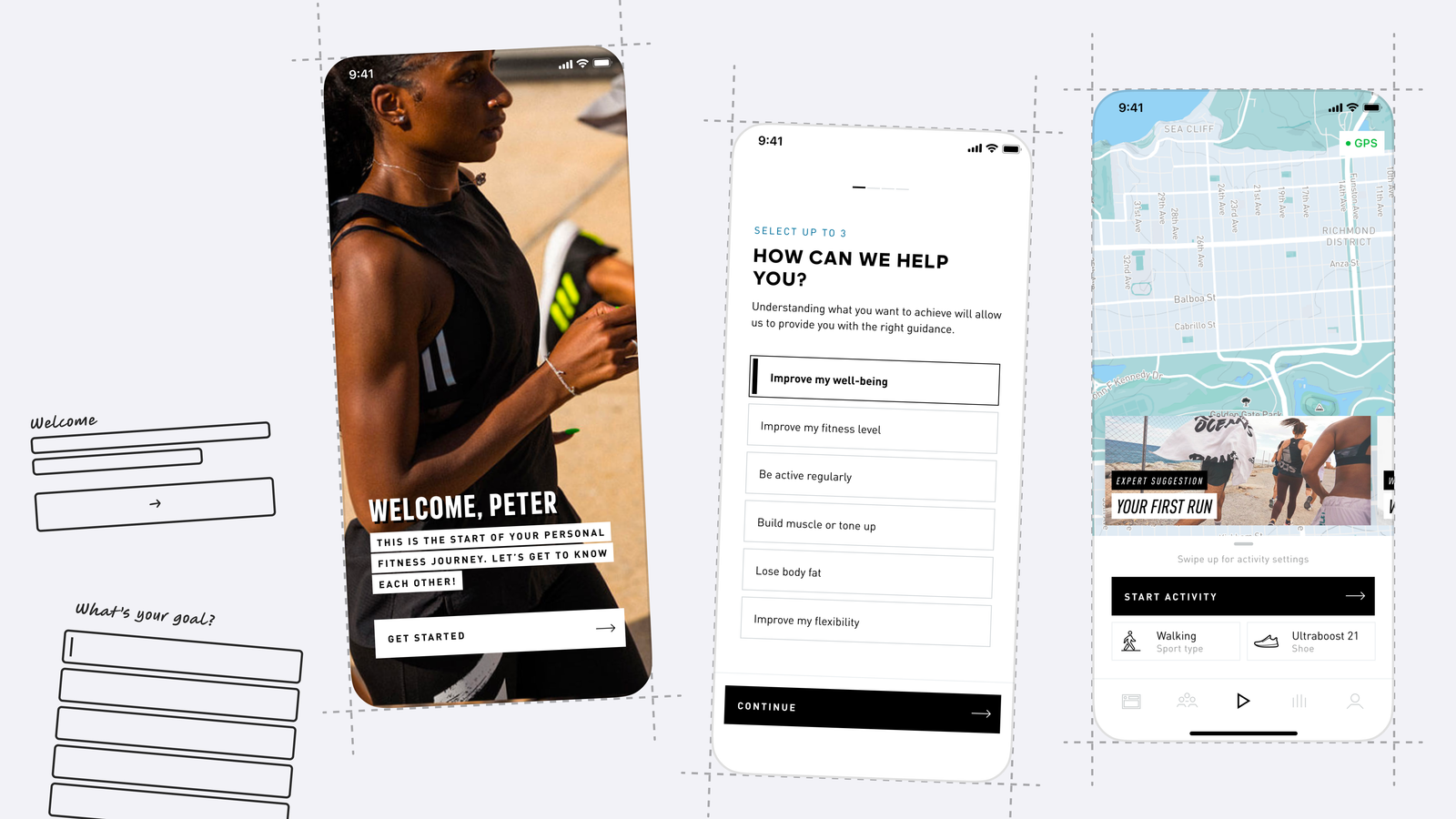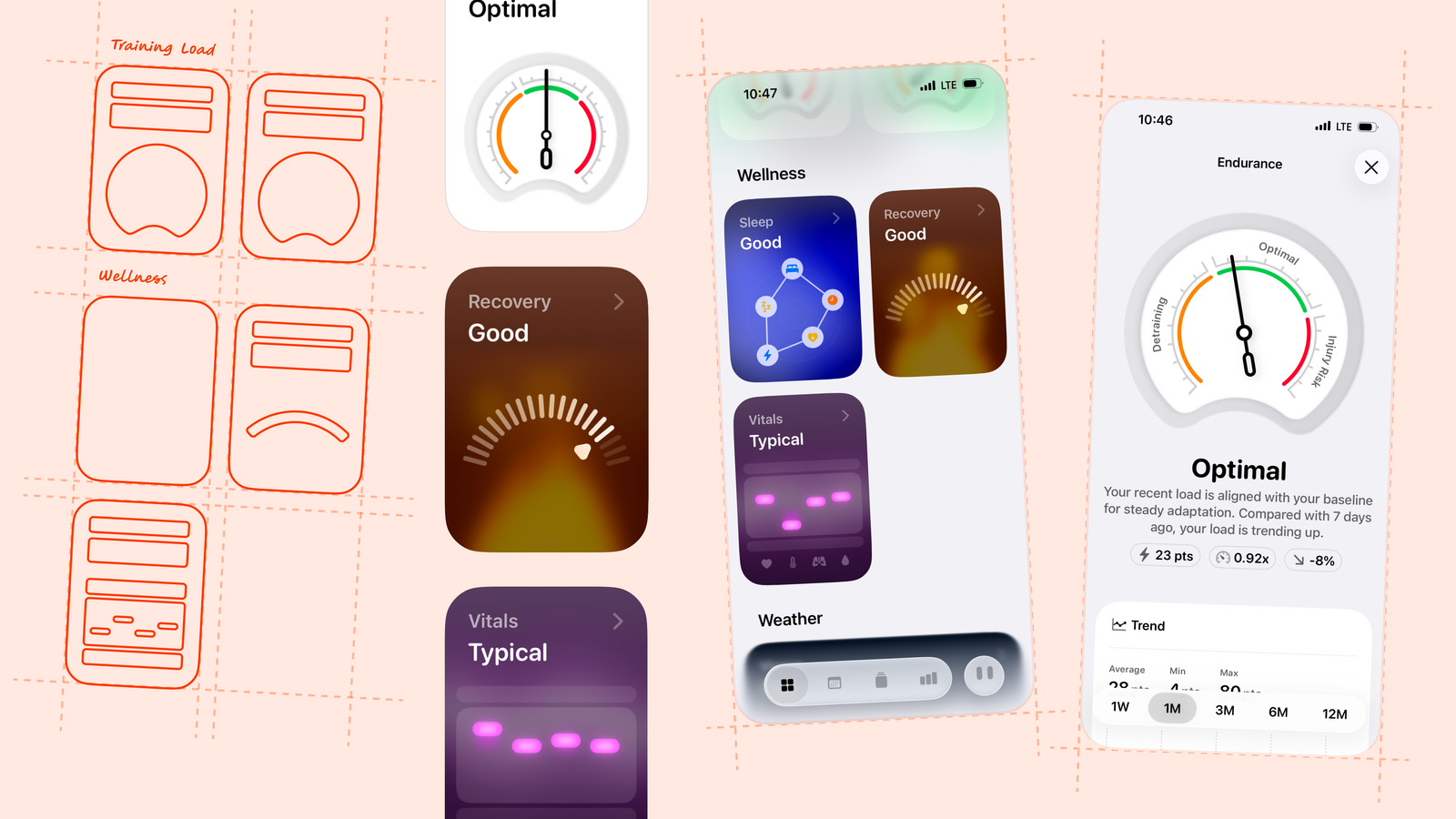


My cofounder Florian and I split a single overloaded Recovery score into three features: Recovery, Vitals, and Training Load. Each one now has its own inputs and its own job. The harder part wasn't computing three scores instead of one, it was deciding exactly where the boundaries between them should sit.
Role: I took ownership of this project, working closely with my cofounder Florian on the score design, calculations, and UI.
One score, no way to tell why it moved
Whistle's Recovery score used to move for reasons that had nothing to do with recovery. A user coming down with a cold, a user who did one hard workout, and a user genuinely overtrained from three hard weeks in a row could all see the same drop in the same number. Each of those affects the body, so technically the score wasn't wrong. But it couldn't tell the user which one they were looking at. And the right response to each is completely different: rest, isolate, or back off training volume.
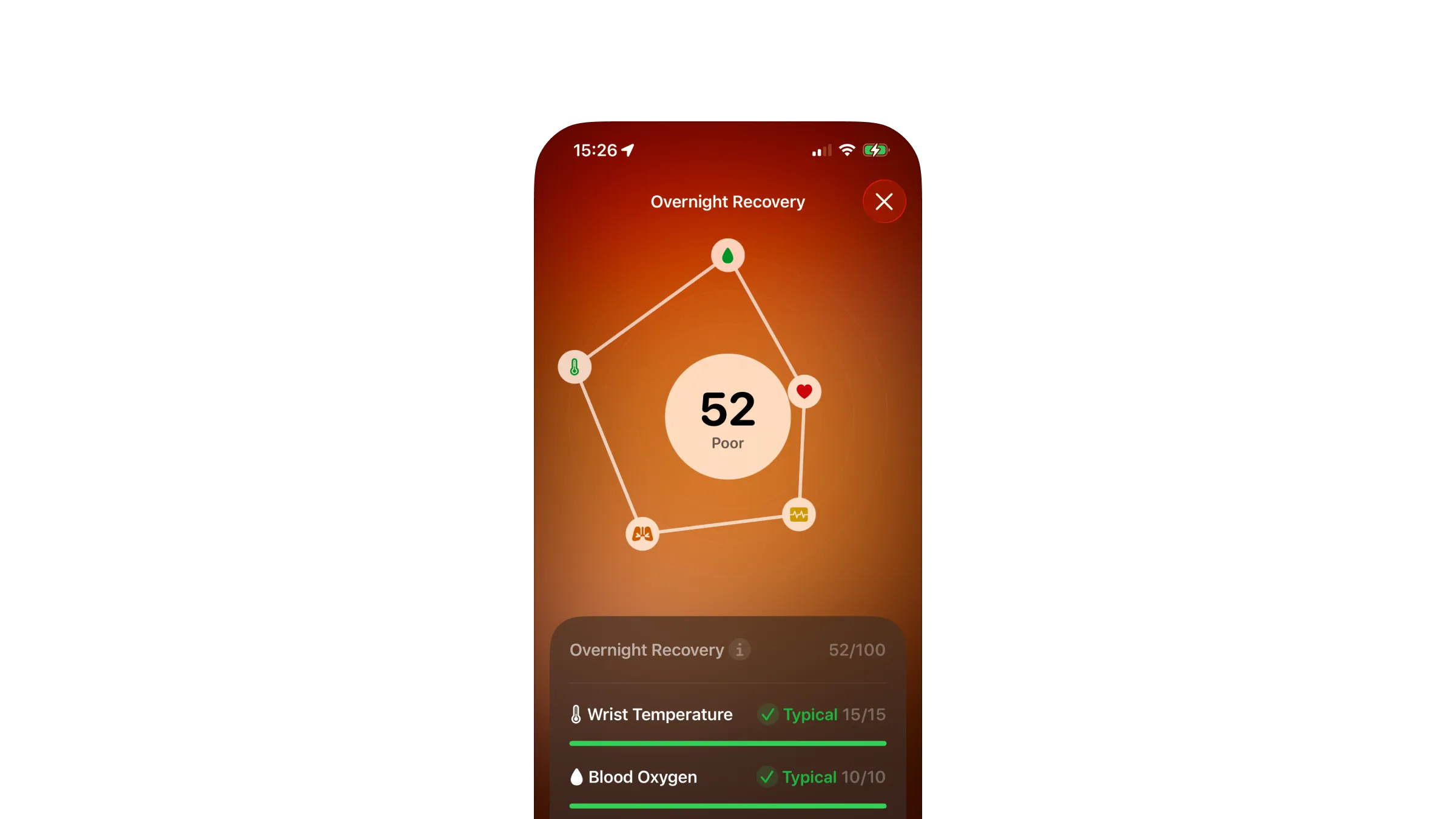
Over time we kept adding metrics to Recovery because more metrics felt like a more complete score. The opposite happened. Heart rate and HRV, the two signals actually tied to training recovery, ended up making up only 60% of the score between them. The other 40% came from wrist temperature, respiratory rate, and blood oxygen, signals that matter for general health but have nothing to do with how a workout affected the body. The score got diluted, and users stopped trusting it. In the example below, heart rate is Very poor, a sustained sleeping heart rate over 80 bpm, and HRV is only Fair, but wrist temperature and blood oxygen score comfortably typical, and even respiratory rate, which is elevated, still scores well enough to pull the overall number up to a 52, "Poor," when recovery should really read much worse than that.
Our first instinct was to fix the score itself. We spent time adjusting the weights, testing different combinations, and coming up with increasingly complex rules to try to make one number behave better. At some point we realized we were solving the wrong problem and stepped back. Instead of iterating on the score, we went back to user interviews and defined the three questions athletes actually wanted Whistle's training intelligence to answer:
- How did yesterday's training affect me?
- Is my body dealing with something systemic right now, like sickness or an altitude adjustment?
- Is my current training load within a range that lets me make steady progress?
That reframing did most of the design work before we touched a single calculation. Once we saw the old score as three unrelated questions stapled together, splitting it stopped being a math problem and became a scoping problem: for each new score, what is it allowed to see, and what is explicitly someone else's job. We backed that scoping with real research too, reviewing competitor approaches and the sports science literature, not just intuition.
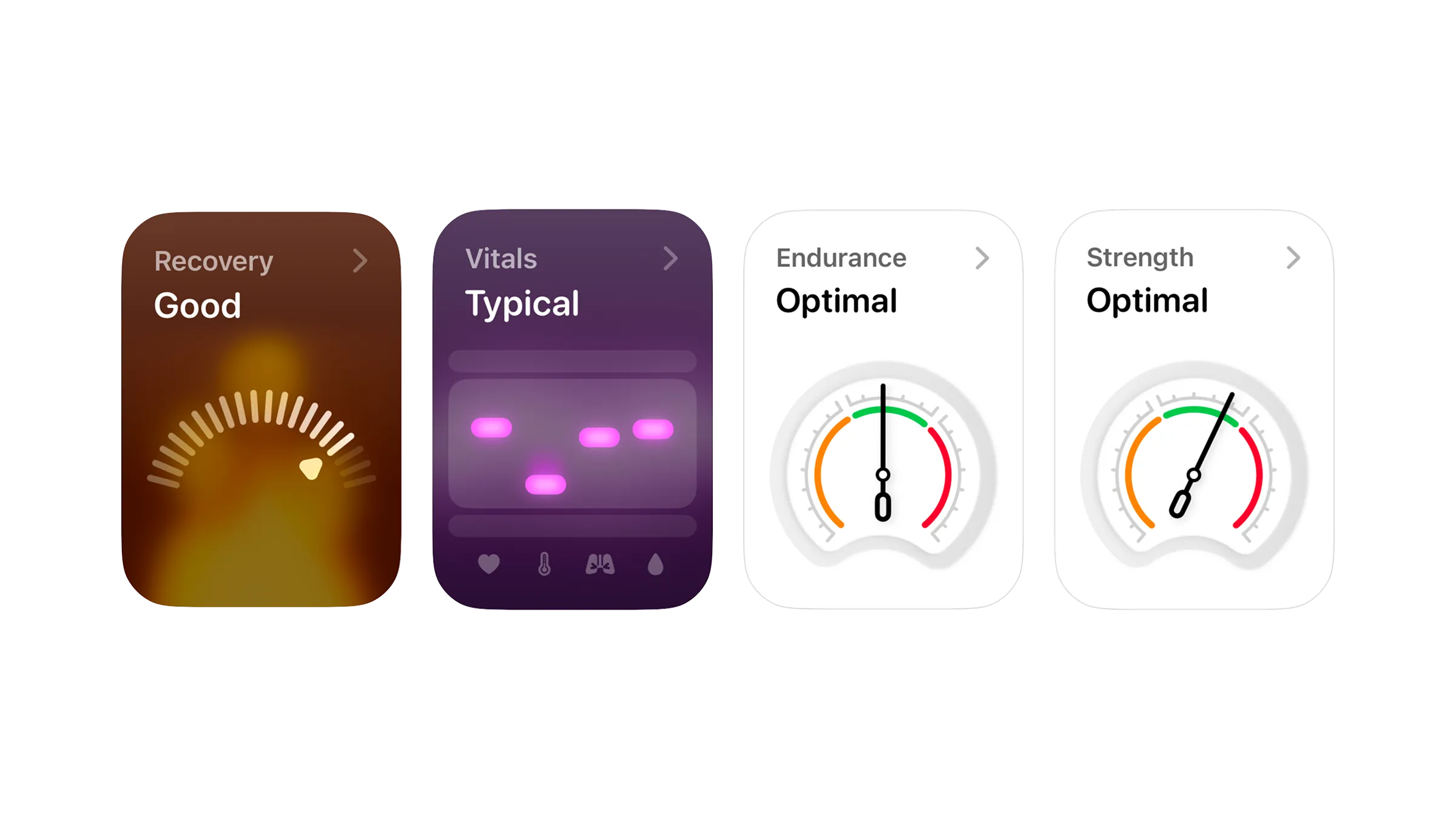
Recovery: fewer signals, a rating instead of a number
The hard part of narrowing Recovery wasn't picking new signals, it was deciding what to cut. Based on our research, we settled on two: sleep HRV and sleep heart rate, both specific to how the body responded to training rather than to health in general.
We also chose to calculate HRV ourselves as rMSSD rather than leaning on Apple's own HRV number, which is based on SDNN. That was a deliberate tradeoff: more work for us, but it gave us a better, more reliable score and aligned us with what's become the norm for fitness apps, since rMSSD is the more established measure for autonomic recovery in sports science.
We also decided against leading with the raw percentage.Early versions showed it front and center, and it looked precise in a way we couldn't back up. Two overnight signals don't add up to a number worth trusting to the decimal point, so the headline became a rating instead: Excellent, Good, Fair, Poor, or Very Poor. The gauge still fills based on the underlying value, so you can see how far into that rating you are, but the number itself stepped back from being the thing the app leads with.
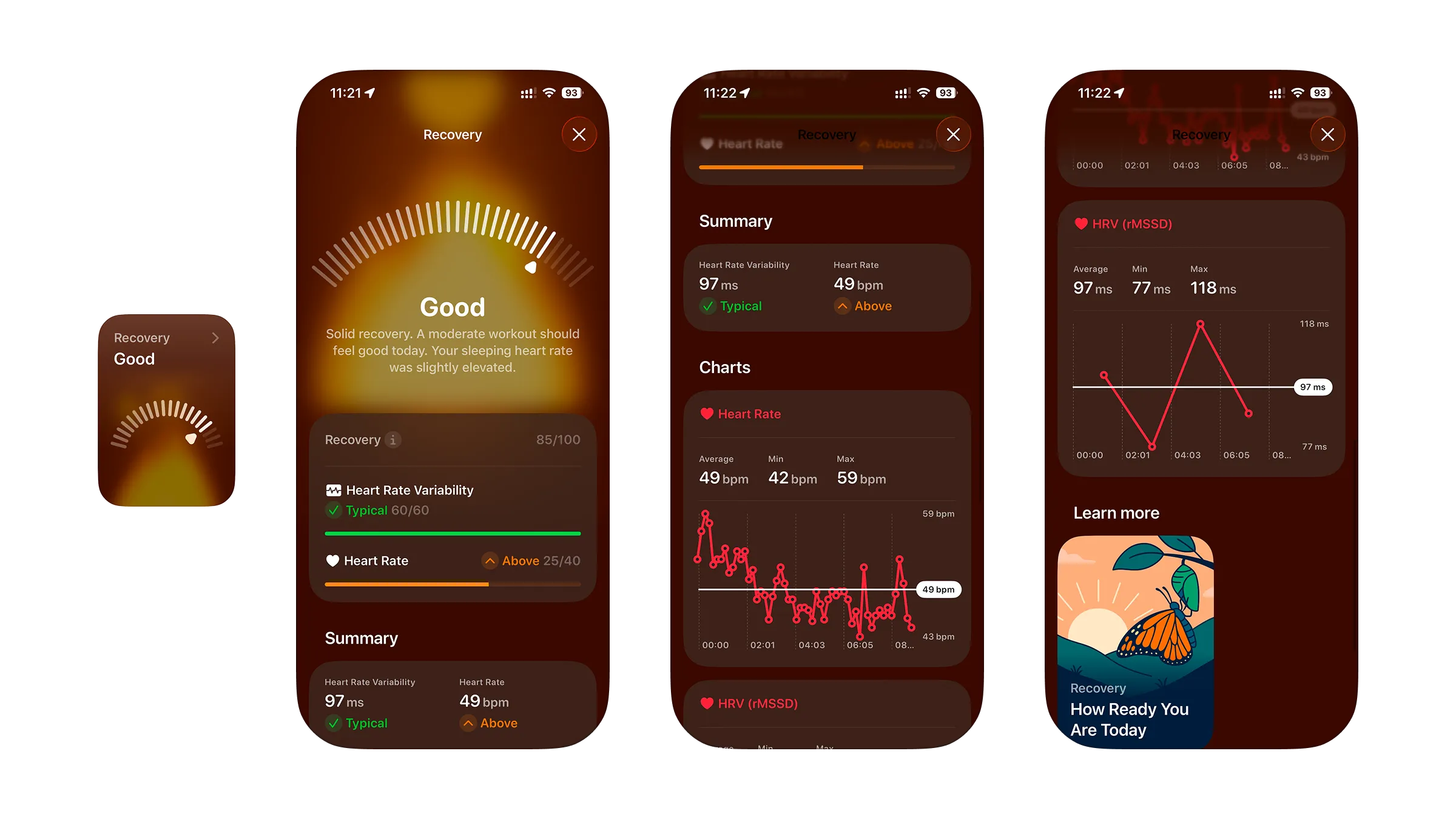
Vitals: not every question needs a percentage
Vitals is built from four signals compared against the user's own baseline: heart rate, wrist temperature, respiratory rate, and blood oxygen. With Recovery and Training Load both built as detailed scores with gauges and trend breakdowns, the natural instinct was to give Vitals the same treatment.
But the question Vitals answers isn't a percentage question. Nobody thinks of their health as being 50% healthy, they think in terms of fine or not fine, so forcing that into a graded score would have been solving a problem nobody had. What we needed was already a solved pattern: Apple Health asks the same yes-or-no question about vitals, and people already understand it without explanation. We didn't need to reinvent that, we needed to answer the same question Whistle's users already had answered elsewhere.
Apple Health already shows vitals, but it doesn't expose that data through its API, so we couldn't just pull it into Whistle. We wanted a complete dashboard where athletes could see everything relevant in one place instead of switching apps, and our AI coach needed the data too, since a coach that can't see whether you're fighting off a cold gives worse advice. Building Vitals ourselves was the only way to get there.
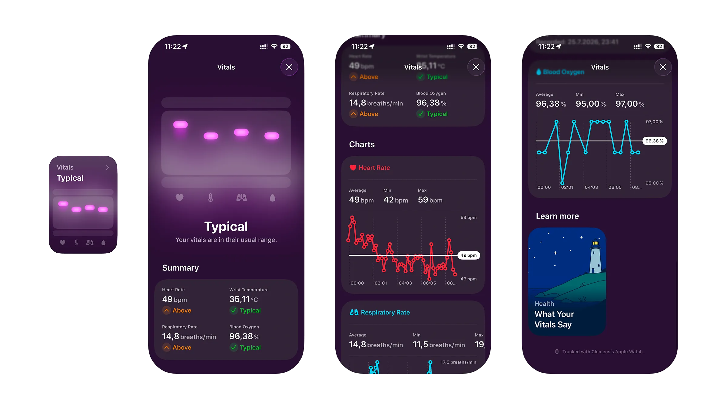
Training Load: why endurance and strength don't share a number
Training Load's job is different from the other two: it looks at trend, not the current moment, the volume and intensity an athlete has accumulated over days and weeks. Our approach here is again based on what's become best practice in sports science, deriving a training load ratio from acute and chronic load.
One issue we ran into was that true strength load can't be calculated from heart rate data the way endurance load can. Lifting hard doesn't produce the same physiological signal as running. That's why we kept strength and endurance load apart, as two separate scores. Endurance load uses TRIMP, strength load uses session RPE. They're not fully independent, heavy training in one can still tax recovery for the other, but they load the body differently enough that blending them into one number would have hidden a real case we cared about: an athlete whose running load is high but whose strength load has room to grow, or the reverse. A single blended number couldn't tell that person which half of their training actually needed to ease off.
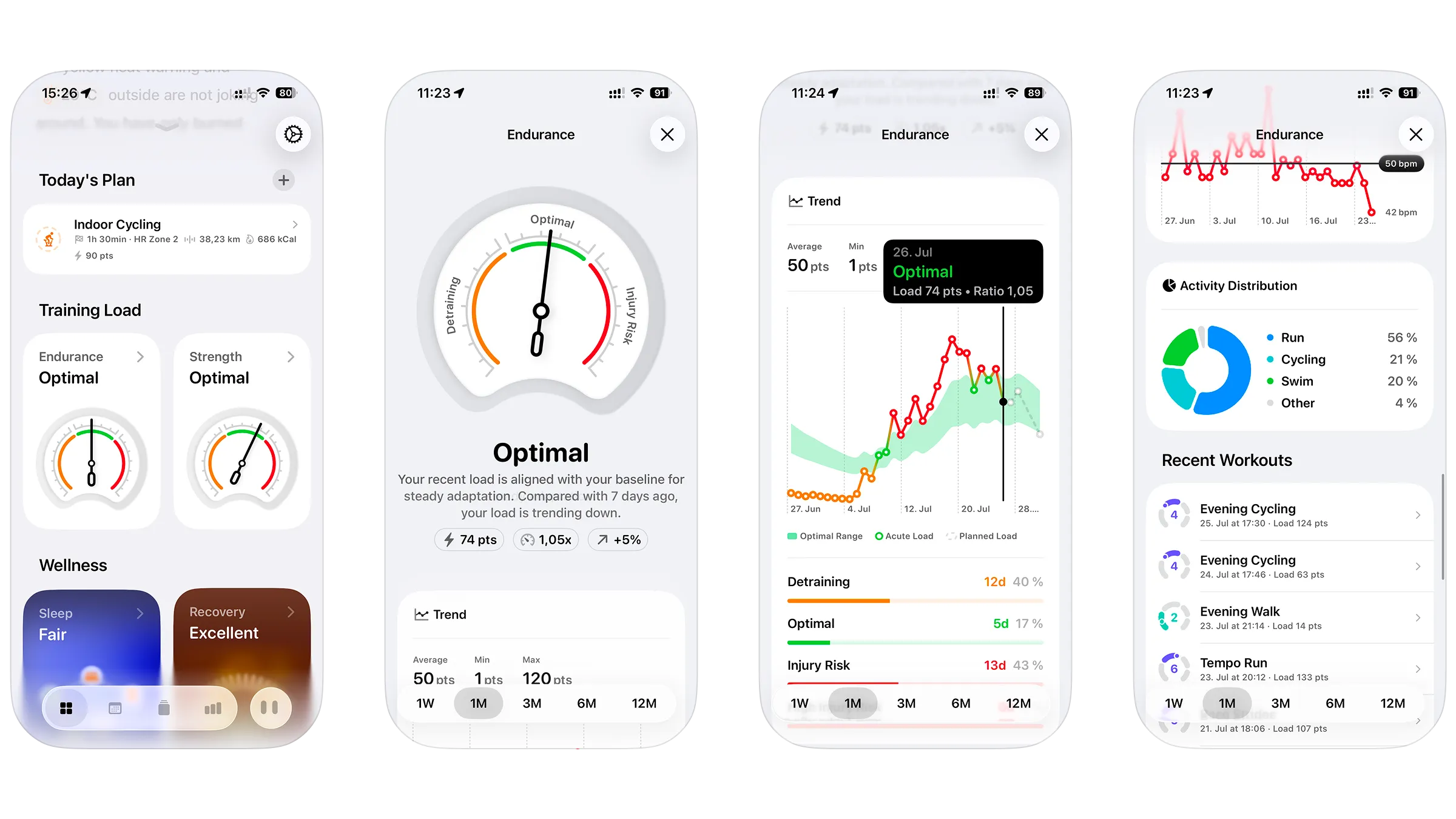
Each shows as a gauge with three zones, Detraining, Optimal, and Injury Risk, so the headline read is immediate. Both detail views share the same trend chart and zone breakdown underneath, but each then shows whatever's actually relevant to it. Endurance load is built on heart rate data, so its detail view goes further with heart rate zones and related metrics like VO2 max. Strength load doesn't have that kind of continuous physiological signal behind it, so its detail view stops at the trend and the workouts that contributed.
What the beta actually told us
We had a working theory of how to split these features before we wrote any code, but theory only goes so far with something this personal. We ran the new features through a closed beta first, then a public one, specifically to see whether users trusted them, not just whether the math held up.
For Recovery specifically, we used an in-app feedback flow that lets users rate their score directly. It gave us a steady, ongoing check that the narrower score was actually landing the way we intended once it was in people's hands.
UI, animations, and haptics
A large part of this project was making these features easy to grasp at a glance while still leaving room for detail underneath. On the dashboard, they come together in small cards that instantly highlight what's relevant, showing easy-to-read labels instead of raw numbers. From there, each opens into its own detailed view, breaking down what's actually behind the label, whether that's the workouts behind a Training Load trend or the individual signals behind a Recovery or Vitals rating.
We also put real effort into polishing the interface itself, adding animation and haptic feedback to each feature so the experience of checking in on your body felt considered rather than purely functional.
Outcome
Recovery, Vitals, and Training Load are all live in Whistle now, completing the training intelligence system Sleep Quality started. The bigger result wasn't the new cards themselves, it was the principle we walked away with: a score that tries to answer more than one question ends up answering none of them well. The AI coach benefits from that too, its guidance is only as good as the context it's working from, and that context is a lot clearer now.
Try Whistle for yourself
Everything in this case study is live in the app today. Download Whistle and see how Recovery, Vitals, and Training Load actually feel day to day.
Download for free